We are all aware that the color trends are shifting and redefining each year. Learn how to add new Pantone Colors for a greater range of creative expression and to ensure that your color palette is fresh, modern and relevant. Don't know where to start. Well, the New York Fashion Week was held in September and left us with an impression of what is to come in the next year of fashion.
It is no secret that what trends in fashion trends in business, which is why we pay close attention to the trend reports coming out of New York Fashion Week. When it comes to determining what is noteworthy, all eyes turn to Pantone. We know Pantone best for their annual Color of the Year. The Pantone Color Matching System is a design industry standard. They are constantly predicting color trends that set the tone for fashion, interior design, websites and so much more in our colorful world. They bring together the science and emotion of color to provide a unique and comprehensive set of solutions for every step in the process of selecting and realizing color.
Leatrice Eiseman, Executive Director of the Pantone Color Institute provides the following explanation on this season's Pantone color choices:
The desire for tranquility, strength, and optimism have inspired a Fall 2016 color palette that is led by the Blue family.
Along with anchoring earth tones, exuberant pops of vibrant colors also appear throughout the collections. Transcending gender, these unexpectedly vivacious colors in our Fall 2016 palette act as playful but structured departures from your more typical fall shades. Blue skies represent constancy as they are always above us. Grays give a feeling of stability, Red tones invite confidence and warmth, while the hot Pinkish Purples and Spicy Mustard Yellows suggest a touch of the exotic.
Isn't that fantastic? Now let us take a closer look at these selected colors as you think of ways to use them in your business this season:
 Listed as cool and calming, Riverside is a relaxing shade of blue that also has vibrancy. Mirroring our favorite pair of denim or a flowing river in autumn, Riverside is a versatile color that will undoubtedly be everywhere this season.

Airy Blue is just that. The designers wanted this shade of blue to evoke weightlessness, especially in contrast to a world full of conflict. Why wouldn't we want to bring that into our lives? Airy Blue was also chosen as a seasonal representative of the color of the year, Serenity.
Pantone suggests pairing this light and uplifting color with Taupe, Lush Meadow, or Dusty Cedar for a stunning color combination.

Gray tones remain as stylish as ever and this season’s Sharkskin is no exception. The color is vibrant enough to stand alone with its blue undertone, yet neutral enough to be used in any color combination for the season. To Pantone, the color showcases practicality through a dependable but contemporary lens. I agree.

Every season needs a strong red and Aurora Red embraces our favorite bold tone of the season. In comparison to the other colors found in this blue-based palette, Aurora red breaks through with passion and confidence. Like a bright lipstick or fast car, items in this shade are impossible to ignore.

Of the two neutrals in this season's collection, Warm Taupe is the earthier and more comfortable of the pair. This timeless color pairs well with both bright and muted seasonal favorites. Its warmth evokes reassurance and stability in a palette studded with cooler shades.

Pantone describes this shade as “a fall and winter version of the Pinks we’re used to seeing in Spring”. It also mirrors the popularity of the rose gold metal trend that has been popping up in fashion and interior design in the past few seasons.

Emerald was Pantone’s 2013 Color of the Year and we see it represented in this color with a subtle blue undertone. Lush Meadow brings in the brilliance of natural green in a season of reds and oranges. This is a no-brainer in our homes and offices already--plants, plants, and more plants.

Pantone designated this color as the exotic one of the bunch, bringing to the table a zestier version of past season’s yellows. It is a bright and energetic color, yet its rich base hue still feels right for the season.

A derivation of Russet Orange, Potter’s Clay is an elegant color choice for the season. It takes an organic earth tone and upgrades it with saturation and depth. I love the way this color reminds us of the last color of the changing leaf--of our favorite terra cotta pot that transcends the seasons.

If this last color seems like a total curve-ball, it should. Pantone selected the purple hue Bodalicious as an unexpected color that speaks to the gender fluidity we continue to see. Though it seems drastic, the pinks and blues that make this shade allow it to coordinate surprisingly well with others this season.
Many businesses use color trends advantageously in their business in order to stay ahead of the competition. Now that you know how to add new Pantone Colors to your business, what are your favorites from the 2016 Color Report?
Or, you may decide to incorporate The 2017 Color of the Year in your business: Greenery.
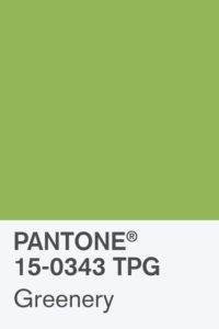
Think of the Color of the Year as symbolic--a color snapshot 'predicting' our global culture's attitude and mood expression. Accordint to Pantone's Vice-President, Laurie Pressman:
There is a growing desire to reconnect with nature and what is real and find ways to disconnect from technology. We need a break. We need to stop and breathe. Greenery is about unity and community—connecting to oneself, others and a higher purpose--nature. But beyond just the natural environment, the color reflects our divided social and political landscape.
For 2017, Pantone projects a "yearning for community, unity, and reassurance". Greenery has links to vegetation and can be interpreted as symbolic because plants regrow and regenerate after the winter season.
I see pairing Greenery with neutrals, brights, deeper shades, pastels and metallics.
I would love to hear how you plan to add them (or already have) to your business this season. Please respond in the comments below.